Surf the web and find one good example of a website that uses hierarchy to guide the viewer’s eye on the homepage Explain how visual hierarchy was achieved (scale, color, spacing, or contrast) and mention the viewer’s pattern if there is one. Take screenshots and use the color picker in Photoshop or Illustrator to create the website’s color palette. Describe the use of color in terms of primary, secondary, and accent colors. Use screenshots to show and discuss the different text styles and choice of fonts for these (mention at least the H1, button, and body text styles).
In this task, I have to explain why the visual hierarchy is essential, how it affects our designs, and how important this factor is for our tablets and all the electronic devices we use today—the importance of the users of design to communicate important messages. Every single element in our design should help improve the user’s experience and will support the message make come through more clearly. I have been reading different articles on the hierarchy in UX design. As a result, I have learned much about the importance of Visual Hierarchy in UX Design and how we can improve our products and optimize the user’s experiences.
Visual hierarchy
The visual hierarchy categorizes design and influences elements in order you want your users to see them. This element can be crucial in planning information architecture to help users navigate products quickly. UX design is all about removing friction and improving the usability of a product, and paying attention to visual hierarchy is a crucial way to do this
Size and scale to pull focus
Sizing is a principle that can give elements more importance than others and draw the viewer’s eye toward a specific area. When we increase the scale of one part, we attract the viewer’s attention. For example, here I have the website of a well-known international artist who is promoting his latest album; in this image, the photo of him immersing himself in the water is the focus of attention; the album name is “Battito infinito” or infinite beat in English, Here the focus is on the new album, and the tour that will take place after the launch, for me this is an obvious and direct way to show the latest product and focus only on this, our eyes are drawn directly to the artist and then to the title of the new album.
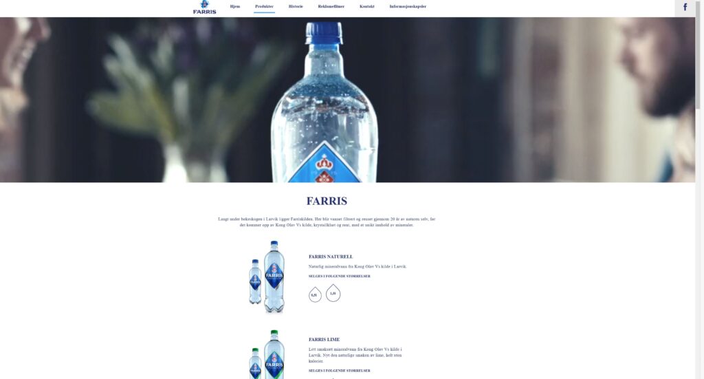
Another example is Farris’s picture; here, we see how the use of size and scale helps to emphasize visual hierarchy. The first thing you’re drawn to in the design is the massive photo of the crystalline water and then the text that explains what the product is all about.
Color and contrast
To give more importance and emphasis to elements in our design, we can always use colors; brighter colors are alleys going to grab the viewer’s attention much more than dull, non-saturated colors. At the same time, colors with higher contrast will appear heavier and closer to the viewer, giving them more sense of importanc
In the example, from Benetton we can see that brighter colors immediately call our attention; by using one bright color as a focal point, the designer draws attention, no matter where you place that element in the order of your design. the attention goes directly to the element on the left.
In this other example, we notice the highly contrasting color on the logo and the buttons that serve as the most important call to action. The color also dominates all the place’s aesthetics and highlights the website’s cheerful and casual style. Through those elements, we are helping the users to understand where you want them to go; we can give them a more pleasant experience.
Perspective
Perspective can help us create an illusion of distance or separation that will allow us to bring focus on the elements that are important to our designs. To achieve the illusion of perspective can we increase the size of parts in relation to those around it; this will make those elements appear closer to you. Adding a parallax motion effect to your pieces to move slower or faster than those around them, adding drop shadows, or adding a blur over a background or foreground layer can also have a dramatic effect.
Here the perspective was used to give emphasis to the robot that is on the left. In this way, the first thing that the user focuses on is the robot and the information that is next to the new game that is being launched.
Another example is the Vikings restaurant. The first thing you find when you open the page is a photo of a table that uses the blurry effect to give the perspective to the main text that is . “are you ready to eat? Huh?”
Here’s another example, with the use of perspective, here the designer uses parallax motion as the format to emphasize the artist.
Each person has a subconscious viewing pattern that they typically use to scan content, this pattern may be different for each person and might change slightly depending on the type of content they’re viewing. Still, the two most popular viewing patterns people use are the Z and F patterns. Those patterns serve a unique purpose based on the type of content you’re designing. Designing your content to flow with these patterns will help viewers have a much better experience. Let’s take a look at these two patterns in more detail.
Z-Pattern
The Z pattern follows a path from top-left to top-right, then down to the lower left, and across to the lower right.
This pattern is best used for content that is not text or content heavy this will help readers scan through each element quickly and get a sense of where you place the importance of each element.
“Ving” page is designed to show multiple options at the top, scanning horizontally and then placing a tagline along the diagonal direction right to the se more and book and finishes with a call to action for their product. All information is laid out very clearly, in a path that most people are already subconsciously drawn to use.
.
F-Pattern
F-Pattern works as it allows readers to scan; naturally, This layout is natural & feels comfortable as we prefer the reading top to bottom & left to right. There is a website in web application development that uses this pattern. In addition, most advertisements rely heavily on F-layout as they drive user engagement in a more natural & comfortable manner.
The F pattern is more prominently used on text-heavy pages like articles and blog posts, the viewers usually scan sites from the top left to the top right, then down to the following line from left to right, and so on. This is similar to the direction most of the western world reads.
Take advantage of fonts
Using the right combination of fonts can give your website its personality and draw attention to specific areas.At the same time, fonts with various types, sizes, and weights can increase the hierarchy to make the most critical text elements stand out.
Websites are primarily designed to use titles of different sizes and give importance to or highlight the associated content.Therefore it is essential to use title 1 (H1) as the largest and most important title of a page and use titles 2 (H2), 3 (H3), etc.,to point out less critical areas.So we will help the reader to scan pages of text to reach the exact location that interests them.
Websites are mainly designed to use titles of different sizes and give importance to or highlight the associated content.Therefore it is essential to use title 1 (H1) as the largest and most important title of a page and use titles 2 (H2), 3 (H3), etc.,to point out less critical areas.So we will help the reader to scan pages of text to reach the exact location that interests them.Both the College of Teachers and the University of Oslo are examples of sites that use headers to give the content an order of importance.Both pages have the most extensive banner header section with additional information and some calls to action that make this area feel more critical.Below the banner are many teams with smaller headers to introduce more features.In addition to font size, we can also use different font weights to make fonts of the same size appear heavier or lighter.You can also balance larger fonts that are lighter in weight with smaller fonts that are heavier, so they are perceived as equally important.
Balance and symmetry in the visual hierarchy
Elements symmetrically arranged on a page can help balance a design, keeping things simple, organized, and easy to digest.
In the photo, Jalapeno uses symmetry on its home page to focus on its new product. It offers different options to develop the new proposal, such as seeingthe Instagram girl.The focal point is directly in the center, yet looking around the page to find more information without feeling lost is easy.
In this image from Madonna’s website, the lack of balance and symmetry is used in contrast to that of the jalapeno to convey the importance to certain elements and help her designs appear more fluid and random. Here we can see different photos of the artist captured in the formRandom; despite this, the page still feels balanced, although the elements are placed randomly and there is no symmetry.
Screen alignment
When we align items along the same path, it can help us feel like they are associated with each other, making it easier to explore other similar content around you if one thinks of the various tithings seen many times in apps andwebsites.Proper alignment in our layouts will make them more visually appealing and make it easier for users to scan the content on the page, subconsciously offering a relaxing reading experience.